The site’s name is officially changing and we’ve got a brand spanking new logo! Here’s why and – just because I thought it might be interesting – what the thinking behind the design is.
With Magnate now going into mass production, I realised it was time that Naylor Games had a proper logo and for the site’s name to change. After all, once Magnate is out there, Naylor Games can truly call itself a publisher and this site won’t just be a blog anymore. And what better time to start building some level of recognition than having the logo you really want on your first game?
Like any good logo, I wanted something to communicate what Naylor Games is trying to be that would be both memorable and visually distinct. Of course, that’s much easier said than done and I thought this post might be an opportunity to explore the thinking and process behind how we came up with this design.
Why now?
I deliberately didn’t spend much time on it in early stages for a couple of reasons.
First of all, I wasn’t sure if there was going to be a game beyond Magnate. Getting this to market was my dream and although I committed to the self publish route back in early 2018, I wasn’t initially sure I wanted to publish beyond that. The whole game development process turned out – for the most part – to be even more fun and fulfilling than I expected. And even if I don’t do this for the rest of my life, I now know I want to take a shot at building a successful publishing house.
The second reason is that at the beginning, a logo wasn’t all that important. A classic thing I see quite a lot in new businesses is the rush to focus on the trappings of business; rather than what it is actually about: creating an organisation that generates value for its customers at a profit. I understand why. When you don’t yet have customers or sales, making a logo, a website or even getting office space (really not a great idea unless the rent is *very* cheap) makes the whole thing feel more real, which can be a morale boost. But those things should ultimately only ever be a means to a particular end. In my view the initial priorities were clear: get Magnate into people’s hands so they can enjoy it and – when they don’t enjoy it so much – give me feedback which will enable me to improve it. For that purpose a Naylor Games logo wasn’t relevant. People don’t have a lot of space for you that you get to rent in their heads. If there was one word I wanted them to remember it isn’t my name, it’s MAGNATE: MAGNATE, MAGNATE, MAGNATE. That meant all the focus needed to be on that when it came to marketing material. Besides, given the design blog focus of the site (which I dearly want to get back to soon!) a title that befitted what I was trying to do – “James Naylor: Game creator” was better than just calling it by a URL I purchased for brevity and future proofing.
What can a good logo do?
A logo is an opportunity to do two things: 1) Create something eye-catching and memorable that people can attach in their mind to what they think and feel about your business and 2) Communicate something about what the organisation is about in that image.
By default, people will associate some image with your company. So the first thing is really just an opportunity to be stickier: the bolder and more distinct the logo, the better chance that the whole company identity will likely stick in the associative web that is human memory. Lots of logos are pretty bland or similar to others. This can sometimes be deliberate. Some companies would much rather a project a clean, unthreatening and professional if bland image than risk something that sends the wrong message and sticks in the mind for the wrong reasons.
But for games companies, I think this is normally less of a risk than it would be for a professional services business, for example. After all, games are supposed to be fun: so appearing unserious or even ‘wacky’ is unlikely to ever lose a publisher any business. This is why I think its a bit sad when entertainment company logos just ape the professional, clean style. They’re missing an opportunity to communicate their creativity. I think the same is also true when they embrace the fun but don’t spend enough time thinking about what they want to say – they’re missing out on the power of the second thing logos can do. Instead they often just go for something jazzy looking that is a literal iconified version of their company name. Or they choose some archetypal game imagery, relatively randomly, to indicate the company is about games without thinking about what it could say about their games. As a result, the relative distinctiveness is also lessened: If you’re not thinking hard about your unique identity, it’s easy to default to using the broader patterns of design that all similar companies use.
What was the process?
In this case, I had a somewhat clear idea for the design immediately. I sketched out some ideas and created a digital one of my own for the Magnate sample box like this:
![]()

I am not an artist, so these weren’t very satisfactory to begin with (the one on the left looks like a mountain-wear brand!). But crucially, they helped me start communicating the idea. Next I briefed the logo into two different designers so they could do some concepting work. I provided my sketches, described what I hoped the logo could achieve and included multiple reference materials to capture the kind of mountain I wanted. They tried out many different ideas – which allowed me to think through what it really needed and what was more/less important. I showed these to friends and colleagues and got them to give me their feedback to help steer it further. The two front-running concepts were these:


As you can see, they are very different styles, and neither was quite right yet. But with them, I could re-brief to the designers and even begin iterating myself using Adobe Illustrator. While I am not an artist and don’t have the required visual flair to take something from brief to finished art, I have become relatively competent with editing vector graphics. To make all the small visual changes required to bring Magnate to market, it became a practical necessity. So it was easy enough for me to spend a few hours playing with the designs, iterating further with more feedback from colleagues until I had the final design:

Why this design?
Now comes the part where I could look very silly.
It’s all well and good to describe the theory and note where others have, perhaps, not used the logo to its full potential. Its another thing to do a good job yourself. So here’s my explanation for why I made the choices I made for the Naylor Games logo. It’s up to you to decide if I did a good job or not.
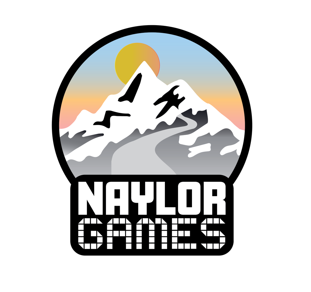
First practically, I wanted something with strong black and white lines. It would be high contrast (more likely to stand out) and fits nicely with what limited design scheme we’ve been using so far: the current Naylor Games logo, the site template and little “NG” insignia we use on Kickstarter or other materials I’ve created already. Black and white can also lend a little gravitas to a design. That is appropriate because as any who knows me knows, I take all projects quite seriously, even when they are about fun. Hopefully it can subtly suggest we take the business of our customers amusement pretty seriously: We will work and think very hard so other people in the future have the very best game experiences we can possibly create for them. We’re not a group of people having a bit of a laugh while we happen to make games on the side: that’s just not our style. We are absolutely committed to making them as great as they can possibly be, sometimes at considerable cost to ourselves. Making games is just so inherently fun the pain sometimes involved is absolutely worth it. So some degree of gravitas is correct when it comes to communicating what we’re about more specifically.
Crucially though, I also wanted a big splash of colour – which we tried to achieve here with the gradient colours of the dawn light over the mountain. Ultimately Naylor Games is still making games: Its about bringing moments of joy into people’s lives – not professionals solving problems (however seriously and professionally we may take it!). Highly varied colour palettes symbolize cornucopia, possibility, variety and diversity. We’re still promising that fun. We don’t want you, the player, to have to take things too seriously. This is a promise of fun.
This brings me next to the mountain itself. It’s a pretty bold symbol. But it captures – as a mountain peak to be climbed – at least what we aspire to: ambition in both product & game design. After all, our first game is an 812 component midweight, miniatures heavy game that recalls some Monopoly and SimCity nostalgia and aims to finally do a deep property game really well for modern tastes. On one hand, that’s an incredibly stupid first time project for a lot of fairly obvious reasons. On the other hand it is indisputably ambitious. And this to be honest, fits my approach, the rest of the team’s approach and many of our collaborators. We would all rather risk failing in a spectacular way trying to do something different and hard than play it safe. So I think of this also as a commitment to make sure we continue living by that approach. The sunrise over the mountain reinforces the same idea. We are trying to do new things – so the dawn is perfect. Symbolically speaking, it’s another big bet for us to live up to, of course. But I’d rather risk us looking silly in the future if this can, in some small way, motivate us to keep the faith and stay true to our ambitions.
Up the mountain there is a winding path leading towards its peak and where the snow gets thick. You could choose to see that as the difficult journey to make something as good as it can be. But that’s not really why its there. What it’s really about is a sense of adventure, the journey we want to take players on. This idea came from one of the designers who worked on it – to capture the spirit of old fantasy illustrations – like this original art from the Hobbit :

In that case, the path is straight rather than winding but it conveys exactly the same idea. A winding path in a more compact design is an easier, even more archetypal storybook way to convey a journey or adventure. And that’s perfect because most games are storytelling experiences too – although the players make the story. They can take you out of yourself for a time and participate in a world you’ve made with other players. Personally, I love games that use powerful theming to do this and such titles are, in general, the ones we want to make. Again it can say something about what we promise and we want to be remembered for.
Lastly we come to the bottom of the logo – the text itself. Here the story is pretty simple. I wanted Naylor to be a stark and boldly rendered. It its after all, the differentiating part of the company name: itself chosen because it was one less thing for people to remember in the early days. They know me and they know a specific game (e.g. Magnate). My view was that they don’t really need to know about a third thing – a company name – which doesn’t really begin to have a real identity of its own until many years and many products have passed. “Naylor” is also a name which is short, punchy and easy to say in pretty much every country I have ever been to. By pure accident of birth, that made it an easier choice than it would have been for other folk. “Featherstonhaugh Games” (pronounced Fanshaw Games!?!) is just not going to cut it in the same way.
Why is “Games” rendered in the more fun font that resembles the squares of a board? This is my attempt to balance the logo further away from the overly serious and finally eliminate the mountain-wear vibes. I think situations like this is where a bit of explicit game imagery can be useful. Alongside all the other imagery, it still highlights that we are a games company, but it’s also fairly subtle and relatively classy, allowing the mountain image to take centre stage. I tried a few other objects, but squares (with the odd triangle) turned out to be the best. I don’t think its a bad ting they could also look a bit like pixels too (a pure accident) as, since the end of the arcade era, such imagery also communicates the idea of fun & games.
Is this all a bit pretentious? Possibly. But I am willing to take the bet that the level of thought in this logo is substantially less than many successful companies spend trying to get the right one (even if they end-up crap in the end). Hopefully it will succeed. Only you and time can tell.
I get what you mean about holding off on the logo early on — I did the same thing when starting Your AI Slop Bores Me, spent way too much time fussing over visual identity stuff before the actual game worked. Your point about focusing on value first, branding second, is real. Once you know people actually care about what you’re making, the logo feels way less urgent. Curious though — did you find that having a proper logo finally locked in the direction you wanted to take the publisher, or was it more just a checkpoint?
Leave a comment