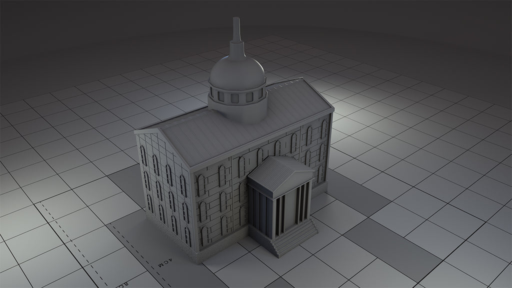
With the receipt of renders I take a closer look at some of the game’s buildings and the source of their inspiration
Everyday that goes by Magnate starts to come together a little more. This week was a major milestone: I received the first ever renders of the game’s 3D buildings from my sculptor. While these are only the first iteration, they already look fantastic.
Why do they matter?
A big pleasure of the game – for me and many of my playtesters – is the way the city emerges in Magnate. It starts off small, but it grows physically as the player’s fortune grows. Happily, it tends to grow in semi-realistic ways: An office in the middle of nowhere rarely does well but a downtown mixed-use cluster full of high value tenants is worth more and will fill-up with tenants quickly. Achieving this effect has been a major design goal, and it’s one I try to make sure the rules deliver by aligning these patterns with what is best for the players/property developers (just like real life!).
It’s perfectly possible to model this emergence with tiles and the game very much stands-up without such physical components. So a basic version of the game using only tiles is is something I will consider. But whatever happens, the campaign will have a pledge level that comes with the full set of 60+ 3D buildings in resin. There’s just such a satisfaction in that third dimension that there is no other way to achieve. So these particular components are critical to maximising the overall experience.
1. House

The cheapest building in the game and the smaller building you can construct for residential tenants. The house is supposed to be a detached family home in a relatively generic and archetypal North american style. I think the sculptor has basically cracked it and the weatherboarding is spot on. The proportions of the parts of the house need a bit more work, but I don’t think this is far off done. Needless to say, the step up from my Lego prototype is substantial!
2. Apartment building

The larger of the two buildings that can house residential tenants, this building is intended to look like the kind of generic small apartment you might find almost anywhere in the US. The sculptor has done a top job here in creating the kind of middle-status building that could have been built anytime from the early 60s onwards. Sadly much of the adorable skylight will need to be removed to make way for a recess for a player ownership marker. This will allow players the indicate that they own this structure without them taking up valuable board real estate (see what I did there?) and maximising visibility.
3. Retail units

This building is the smallest you can build for retail-type tenants (holding two counters) and is intended to resemble a classic strip-mall type structure. I think the sculptor must have done a good job, because I can already imagine a dry cleaners and a Subway in there! Some slight texturing is the main change required and possibly some minor proportion changes.
4. Industrial unit

The smaller of the two industrial buildings in the basic set, it’s intended to resemble a free-standing miscellaneous industrial building of the type you can see anywhere in the world. The 3D designer has done an incredible job on this one. Barring a few door/shutter placements and some slight changes to make the casting process more effective, this is ready for miscellaneous industrial use!
5. Industrial park

This is one of the game’s really big ‘capital’ buildings, which will currently burn a hole in your pocket to the tune of $4,000,000. Quite simply it’s intended to be a collection of different industrial buildings to house a range of companies. I really like what the designer has done with the ramps and the different door scales. The main changes now are all about enhancing the detail. The only major challenge is the size. This thing is close to 50mmx50mm – that’s a lot of tile space!
6. City hall

Possibly the grandest structure of them all, and not (currently) purchasable by players (best saved for a city corruption expansion!) There’s still work needed to give this the feel of a neoclassical city hall of the type seen in settlements across North America (e.g. Georgian style windows) but when it’s done it will be a centrepiece to be truly proud of!


Leave a comment